
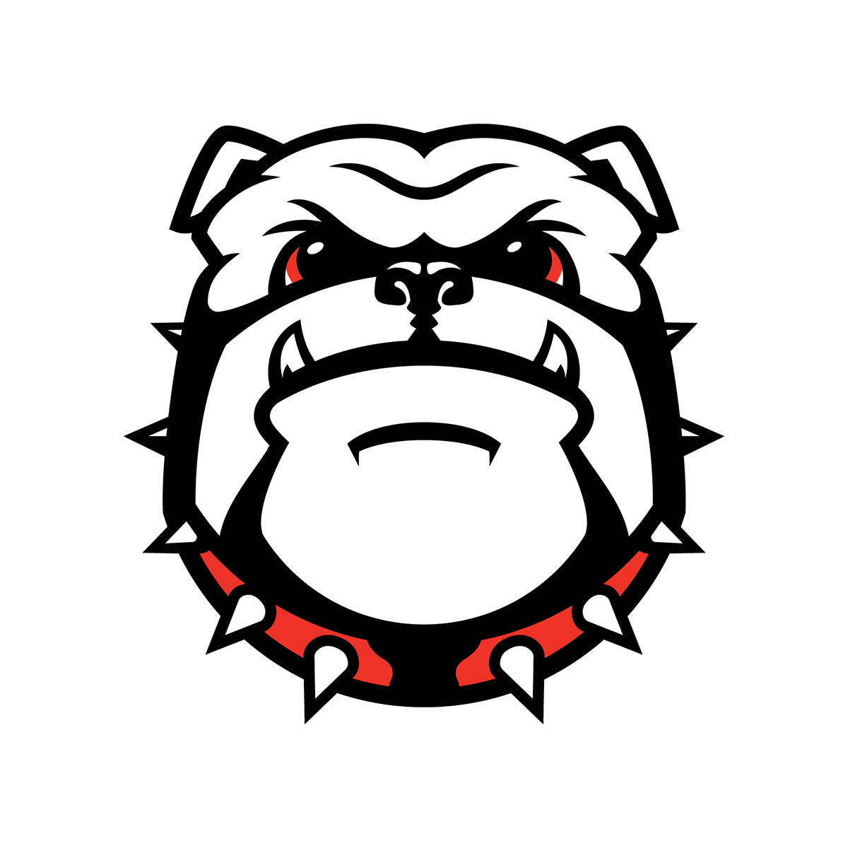
A proof of concept of a stronger, secondary logo for the Georgia Bulldogs.
I never been much for the current, as of 2013, Bulldog head logo. It does not fit in the University of Georgia's traditional look, especially in the style we as fans, alumni, and students have designed images of bulldogs and Hairy Dawg in the past. I made this just to prove to myself that it could be done differently. With all due respect to the designer at Nike who created said logo, a honest critique shows some inconsistent design choices. Obviously this bears resemblance to the existing logo (which I have included below) so I cannot fully take creative credit, but it is my design all around. And it is by no means perfect!
I took inspiration from classic Dawg images such as the original hand-drawn bulldog head. It has a more exaggerated style, steered away from realism without being too cartoonish. The overall shape of my design mimics the more rectangular shape of the old one. The more pronounced lower jaw and teeth reflects the style of the Hairy Dawg mascot without explicitly being an image of Hairy Dawg’s head. The nose, like that on the old style is shaped more like a real bulldog nose. While I am not attempting realism, I see an accurate but simplified version being necessary to getting the character right. The ears are more raised signifying an alert sense. The eyes are larger and brighter to seem more awake with the lids drawn to the outside so it still has the classic bulldog droopiness. It is aggressive yet simple and easy to look at.

Whenever a brand changes a logo or adopts a new one different than we are used to, we collectively tend to rebel to the change. With this consistent response in mind, and my allegiance to the University as a recent graduate, my critique of the current logo will be objective and not based on a concept of "tradition". The outline and shape of the bulldog head has reflectional symmetry in all but one place: around the cheeks and below the ears. The left side shows the collar curving under the cheek whereas, on the right, the collar continues upwards. It is a puzzling design choice, one that could be attributed to a cast shadow, if there were other elements of the logo that showed a directionally cast shadow.
Another issue is the inclusion of the Oval G logo on the collar of the bulldog. An all-time classic design, it does not need to exist there. Secondary logos are created for alternate usage from the primary logo. Therefore, there ought to be no need to include the primary logo within the secondary logo. The new Nike-made Oregon Duck head logo does not have this problem; neither does the Alabama Crimson Tide elephant. Including it creates two awkward problems. For one, the logo is placed on top of a collar spike (Uga the English Bulldog wears a red spiked collar so it is an important symbol). Secondly, the Oval G has a red stroke border that becomes impossibly thin at this size and does not match any other element of the design. It feels like a last minute addition, which means the original designer may not have included it and could have been the result of a design-by-committee scenario. I have respect for the designers at Nike, clearly they are successful because they are good at what they do. Still, this design, while having arched eyebrows and bared canines, lacks a level of emotion. It goes for realism, when UGA has rarely been one to attempt it in bulldog iconography.


